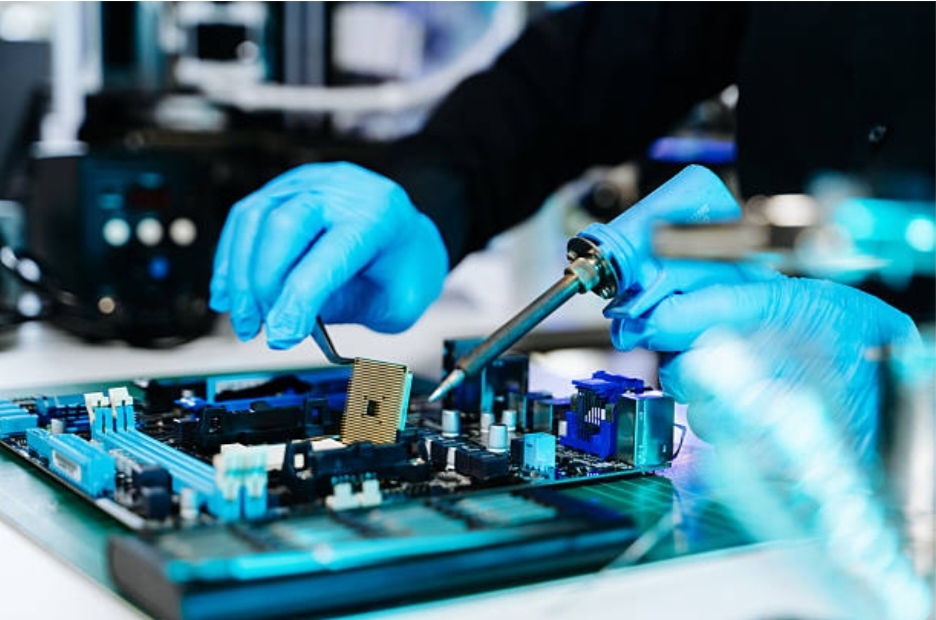
Why Reliable Controllers Are the Backbone of Modern Industrial Systems
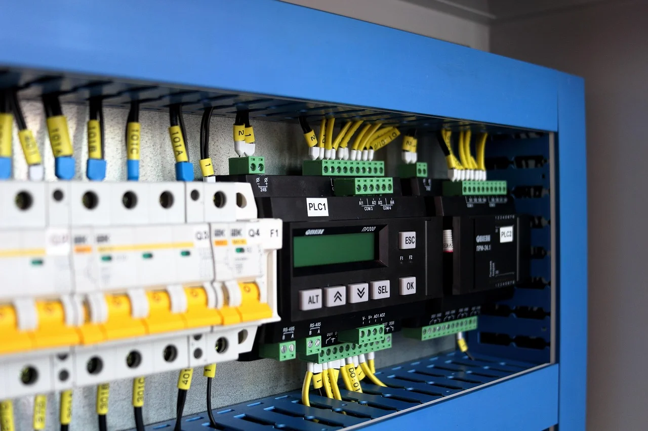
Behind every automated production line, energy management system, or building control network lies a controller responsible for coordinating operations in real time. While industrial automation often focuses on robotics, analytics, or connectivity, controllers remain the critical component that ensures machines respond accurately and consistently. As industries demand higher reliability, longer product lifecycles, and seamless connectivity, … Read more